Scope
The Marketplace update was a large scale project, that included working with Product Manager to scope requirements and pitch idea to executives for product approval. Business need behind the idea was to add a potential revenue stream by allowing subscription fees on SmartApps.
My work on the project started with concepting designs meeting the Product Manager's requirements. Iterating and refining that design based on various feedback from stakeholders. Then I was involved with the pitch to executives, walking through my design with an interactive prototype. After approval was given, I worked with front-end developers and started handing off assets for them to build. As the project grew in scope, we continuously revisited UX flows to make sure that the additional infrastructure was being handled properly. This was a very large scale addition to the app and required regular stand-ups and sprint planning meetings. The lead front-end developer and I became very good working partners and the project became very collaborative.
User Journey
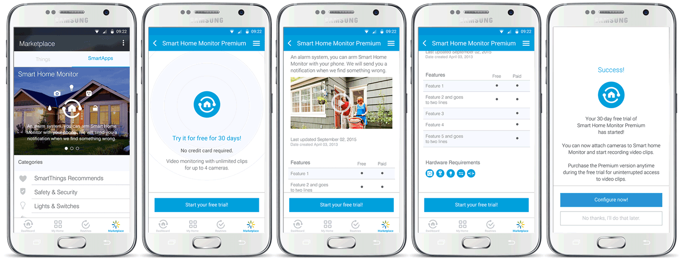
The first change brought to the SmartApp Marketplace was to create a banner image carousel for the main landing page. This would allow SmartThings to highlight special promotions giving the user a simple access point to gain more information. The second big change was to bring more life to the SmartApp detail page. As it's being developed in HTML that leaves a lot of room for individualization and design. I mocked up potential ways for developers to use the page, placing videos showing the SmartApp in use, a table with features, and a little interactive animation at the top of the page to show how the SmartApp can bring the user's devices to life. This page would be a very basic and entry level design point for a developer or business partner. Because the page is designed in HTML, it leaves the door open for business partners to add their own branding to the page.
e-Commerce and Subscription Flows
Golden Path

The Golden Purchase path is shown here. After testing we found that user's could potential get caught in a loop where they're editing the credit card information in the middle of the purchase path. To simplify the process we took out this ability. The only way to edit a credit card is to do so in the My Account tab under the Home menu. Adding a confirmation screen before the actual purchase is happening helped users to fully understand what they were getting and how.
Account Management
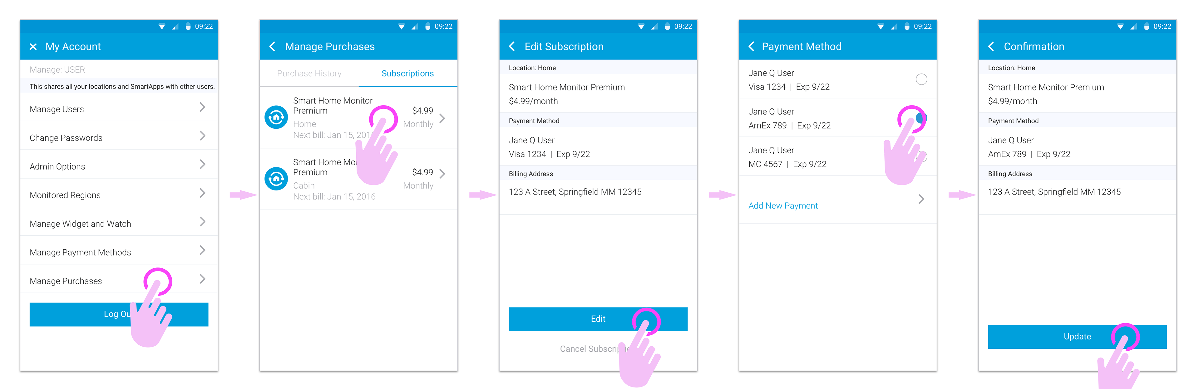
As mentioned above, the only way to edit a payment method is to go through the My Account section within the app. Having this experience outside of the purchase path, allowed us to simplify the process of editing payment methods. It became much more straight forward and again at the end of the flow, showing the user what they changed and allowing them to confirm.
Cancellation

Giving users the ability to pay for a subscription service also meant that we had to develop a way for them to cancel it as well. In this flow it shows the "Cancel Subscription" button is not as prominent but still visible. After the tap, the user is given a modal to confirm.