Some of the work I did at CEB Iconoculture was editorial in nature; producing research briefs and aiding in the production of content for strategist presentations. Here are some examples of data visualizations and infographics that I was able to put together for various projects.

Large scale infographic done to support research that was presented at Iconosphere 2015. I did the overall design and developed some of the icons.
I worked closely with the editorial and data team to ensure that an interesting and relevant story could be told using the minimum amount of data points. We then added quotes from survey respondents to help bring the data to life.

Infographic that was used in a trend article on the use of mobile devices in public. Data was taken from an outside source, that I then used to design the graphic.

This bell-curve type chart is showing the values ranked and differentiated by gender. For example, while the overall ranking for confidence was lower than enjoyment the value of confidence tended to skew higher when looking at responses from men. The chart was used in an Iconosphere presentation in 2014. The conclusion reached by the strategist was that marketing and advertising campaigns for regular everyday items shouldn't try to aim at the outlier values, but rather stick to the middle where they're more likely to reach both genders.
I worked closely with the strategist to come up with this visualization. She wanted something that could show a mass of values, the distance between them and convey the message of commonality. I suggested a bell curve, and we extrapolated the data to create a scatter plot which then I could redesign and add values into the space.
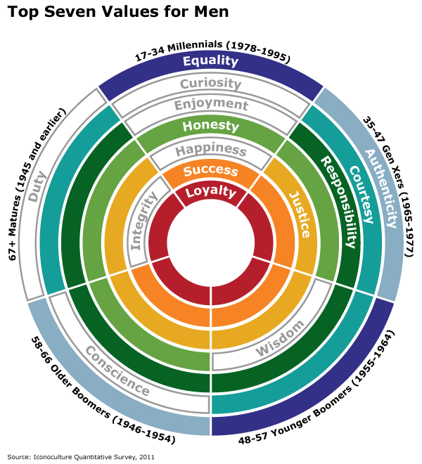
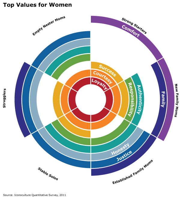
These charts show the highest ranking values for men and women broken down across different demographic segments (age for men and life stages for women defined by a strategist for a custom presentation). The key to these infographics lies in the concentric circles, and using the circles to help represent the strength those values hold across the demographic segments. While courtesy wasn't the #2 value for women across the life stages, it was present within the top seven of all demographics.
I came up with the Men version of the visualization for a custom project for a client that was trying to solve the question of importance connecting the values with a table and lots of lines. By breaking apart the table and reimagining it as connected concentric rings, the association becomes stronger.

Various pages pulled from research briefs.